Creating a calm and timeless atmosphere in your home often begins with the colors you choose. Among the most enduring and versatile options are neutral tones, which can serve as the perfect backdrop for a variety of interior styles. If you’re looking to transform your environment into a soothing sanctuary, exploring the right neutral color palette ideas can be the perfect starting point. These palettes can breathe life into a room while maintaining a soft, sophisticated charm that never feels overwhelming.
Why Choose a Neutral Color Palette
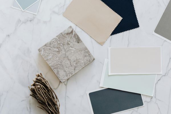
Neutral color schemes are popular for good reason. They offer a sense of tranquility that other color combinations often struggle to match. With hues ranging from warm beige to cool grays and creamy whites to earthy taupes, neutral colors provide a flexible foundation for both modern and classic design aesthetics. One of the biggest advantages of adopting neutral tones is their ability to highlight textures and architectural details. By keeping the color story understated, elements like natural wood grain, exposed brick, or layered fabrics are allowed to shine.
Moreover, neutral palettes provide longevity. Trends may come and go, but a well-executed neutral scheme remains stylish through the years. This longevity not only enhances your living experience but also increases the potential resale value of your home, making it a smart investment in both form and function.
Setting the Mood with Neutrals
The mood of a space can be dramatically altered by the specific tones and combinations you select within the neutral spectrum. For a light and airy feeling, soft whites and gentle greiges can open up a room, making it feel more spacious and inviting. These shades reflect natural light beautifully, amplifying brightness and reducing the need for artificial lighting during the day.
On the other hand, richer neutrals like chocolate brown, charcoal, and deep taupe offer depth and intimacy, making them ideal for bedrooms, dens, or any space where comfort is paramount. These darker shades can create a cocoon-like effect that’s both grounding and luxurious. When paired with plush textures like velvet or natural materials like linen and wool, the result is an atmosphere that soothes the senses and invites relaxation.
Finding Balance with Warm and Cool Neutrals
A common misconception is that neutral palettes are monochromatic or lack variety. In reality, neutral color palette ideas offer a broad spectrum of tones that can lean warm or cool, depending on your preference and the existing elements in your space. Warm neutrals include shades like ivory, camel, and soft gold, which tend to create a cozy, welcoming ambiance. These colors pair beautifully with organic materials such as wood, leather, and woven textiles.
Cool neutrals like slate gray, icy blue-gray, and pale silver provide a more modern and minimalistic feel. They’re especially effective in contemporary interiors where clean lines and open spaces dominate. Combining both warm and cool neutrals in a single space can create a harmonious and visually interesting result. For instance, a warm beige sofa set against a cool gray wall introduces contrast without clashing, offering visual appeal that remains subtle and refined.
Layering Textures and Tones for Depth
The key to keeping a neutral space from feeling flat lies in thoughtful layering. While the color palette remains restrained, you can inject visual interest by varying textures and tones. Imagine a living room featuring a cream-colored wool rug, a taupe velvet couch, and linen throw pillows in shades of ivory and stone. Each element contributes a distinct tactile quality that adds richness to the room, despite the muted color scheme.
This principle also extends to materials. Mixing matte and glossy finishes, rough and smooth surfaces, or rustic and polished elements creates a multidimensional effect that enhances the elegance of the neutral palette. Incorporating natural light further elevates the look, casting subtle shadows and highlights that shift throughout the day and breathe life into the colors.
Using Accents to Complement Neutral Color Palettes
Though the foundation of your design might be built on neutral color palette ideas, accents can still play an essential role in defining the character of the space. These accents don’t have to be loud or bright to make an impact. Subtle additions such as brass fixtures, black picture frames, or greenery from indoor plants can introduce contrast and definition. These elements prevent the space from feeling sterile or one-dimensional while maintaining the serene essence of the palette.
Artwork is another powerful tool in neutral spaces. Abstract paintings in monochrome shades or delicate watercolors can add depth and emotion without disrupting the overall harmony. Even books, ceramics, and textiles curated in complementary tones can enrich the visual story you’re telling through your interiors.
Adapting Neutral Palettes for Different Rooms
Each room in your home has a distinct function, and your choice of neutrals can reflect and support that purpose. In the kitchen, crisp whites paired with soft gray cabinetry can evoke cleanliness and efficiency. Natural stone countertops and wooden cutting boards reinforce the warmth and add organic charm.
For bedrooms, creamy off-whites, gentle browns, and touches of blush or mauve can evoke calm and promote restful sleep. These hues work especially well with soft lighting and plush bedding. Meanwhile, a home office might benefit from cool neutrals that encourage focus and clarity, such as pale slate or muted taupe, paired with sleek metal or glass accents to inspire productivity.
Bathrooms, often the smallest spaces in the home, can be transformed into luxurious retreats using a well-chosen neutral palette. Soft beiges, marbled whites, and muted metallics work together to create a spa-like atmosphere that feels clean, serene, and rejuvenating.
Timeless Elegance with Modern Appeal
What sets neutral color palette ideas apart is their remarkable ability to transcend time and trend. Whether you gravitate toward farmhouse, Scandinavian, minimalist, or traditional design styles, neutrals can adapt and elevate your aesthetic. They offer a quiet elegance that feels intentional yet effortless. While color fads may rise and fade, neutrals endure—always relevant, always inviting.
This versatility also means you can update your decor seasonally without clashing with your existing palette. A few simple changes in accessories or textiles—like swapping in a rich wool throw for winter or introducing lightweight linen in the summer—can refresh your space while maintaining consistency.
Conclusion: Embrace the Power of Neutrals
In a world that often feels chaotic and cluttered, the simplicity and sophistication of neutral color palette ideas offer a breath of fresh air. These palettes don’t just decorate a room—they shape how you feel in it. Whether you’re designing a new home or refreshing your current space, neutrals provide a versatile and timeless foundation that promotes peace, balance, and beauty.
By thoughtfully layering tones, incorporating texture, and embracing the natural interplay of light and shadow, you can transform even the simplest of spaces into a serene and stylish retreat. Let your home be a reflection of calm elegance—starting with the perfect neutral palette.